
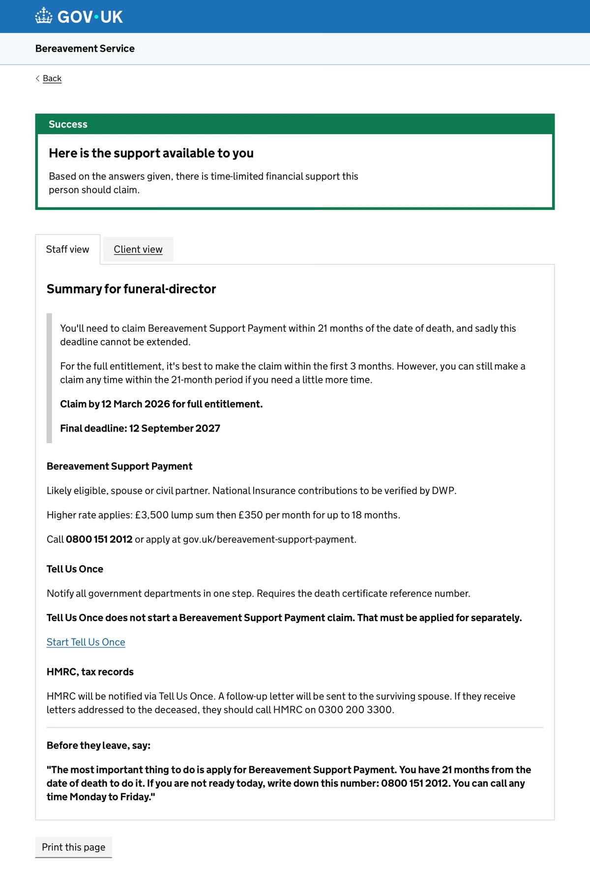
Staff viewFor the professional
Deadlines first, then each payment with likely eligibility and the number to call.
Case study · 9 min read · 30-second summary below
When interviewing recently bereaved people wasn’t possible without ethical risk, I changed our research method. What we found led to a service that reaches people first, instead of waiting to be found.
The statement
Bereaved people have three months to claim the full Bereavement Support Payment. I couldn’t find one official touchpoint that tells them.
01 · The problem
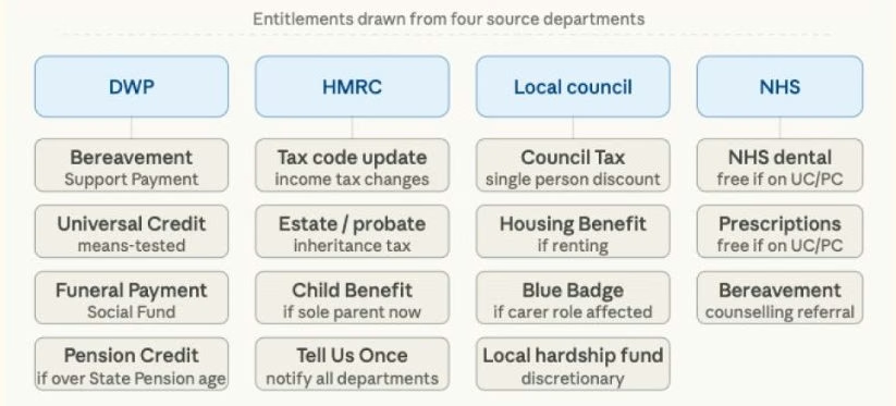
When someone in the UK loses a partner, they may be owed support from DWP, HMRC, their local council and the NHS. Each has its own rules, forms and deadlines. No single service tells them what they qualify for.
The deadline that matters most is easy to miss. The Bereavement Support Payment (BSP) has to be claimed within 3 months for the full amount. Claims up to 21 months after the death get fewer payments. I found no government message that tells people this, so finding out is left to them, at the moment they’re least able to look.
Help does exist, but in the wrong places. Tell Us Once is offered when a death is registered, yet it’s underused. Registrars, GPs and funeral directors are trusted at exactly the right moment, but they don’t have the tools to point people to the right support.
From a published survey we analysed.
One of nine secondary research findings
High satisfaction scores in existing data only count the people who made it through. Those who never reached the service don’t show up at all.
“Users switch between websites, helplines and offline services with little continuity across channels. Vulnerable groups (digitally excluded, low-literacy, disabled) face the greatest barriers at the worst possible moment.”
Secondary research synthesis, UK bereavement service landscapeThe brief
Get bereaved people the right information at the right time. The service should reach out first.
02 · The pivot
The obvious first step was to interview people who had recently lost a partner. In five weeks, that wasn’t possible to do well.
Recruiting recently bereaved people in five weeks raised serious ethical concerns. A rushed interview with someone in grief risks harming them, and gives weak data.
I proposed a different method to the team: a large-scale analysis of what bereaved people had already written in public. Then I led it.
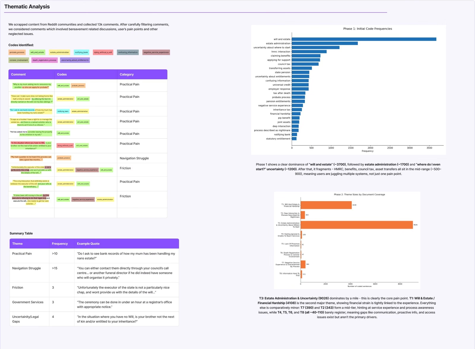
A dataset of 636 posts from three Reddit communities, analysed with Braun & Clarke’s six-phase thematic analysis. Public posts only, usernames removed, ethics documentation in place.
People who post online aren’t a fair sample of all bereaved people. I treat the findings as directional, not proof.
Communities: r/UKPersonalFinance, r/LegalAdviceUK, r/bereavement. Method: Braun & Clarke (2006).
It gave us more material than five weeks of recruiting ever could have, and nobody in grief was asked to relive it for our research.
03 · The posts
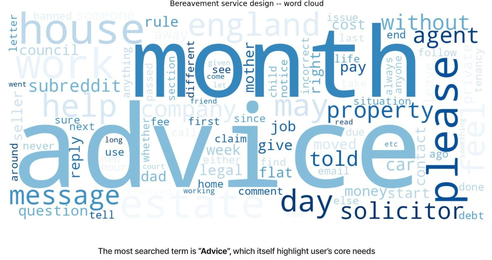
People asked for advice, not information. The most common keyword across all three communities was “advice”. My reading: people were turning to strangers online because official sources weren’t telling them what to do next. The system had plenty of information. What it lacked was direction.
The smallest theme mattered most. Ranked by size, the themes point at estates and paperwork. Read for meaning, the smallest one stands out. Try both views.
What I learned
How often something comes up isn’t the same as how much it matters. I almost skipped this theme because it was the smallest.
04 · The people
To see where the system fails in practice, I built two composite personas from the stories in the posts and mapped their journeys. The journeys showed failure points the theme counts had only hinted at.
“I don’t even know what I don’t know. I just need someone to tell me what I’m supposed to do next.”
Sarah needs a clear starting point instead of ten options, plain language, deadline reminders, and to know she’s doing things right. She screenshots pages, starts forms then stops, and searches late at night once the children are asleep.
“I just want one place that tells me what to do step by step, not ten pages telling me everything at once.”
James needs one step-by-step place, plain English, a clear “do this now, do this later”, and progress he can come back to. He opens several GOV.UK pages and doesn’t know which to start with, avoids phoning organisations, and is managing grief and urgent admin on his own.
She found out about the council tax single occupancy discount three months late, after the full backdating window had closed.
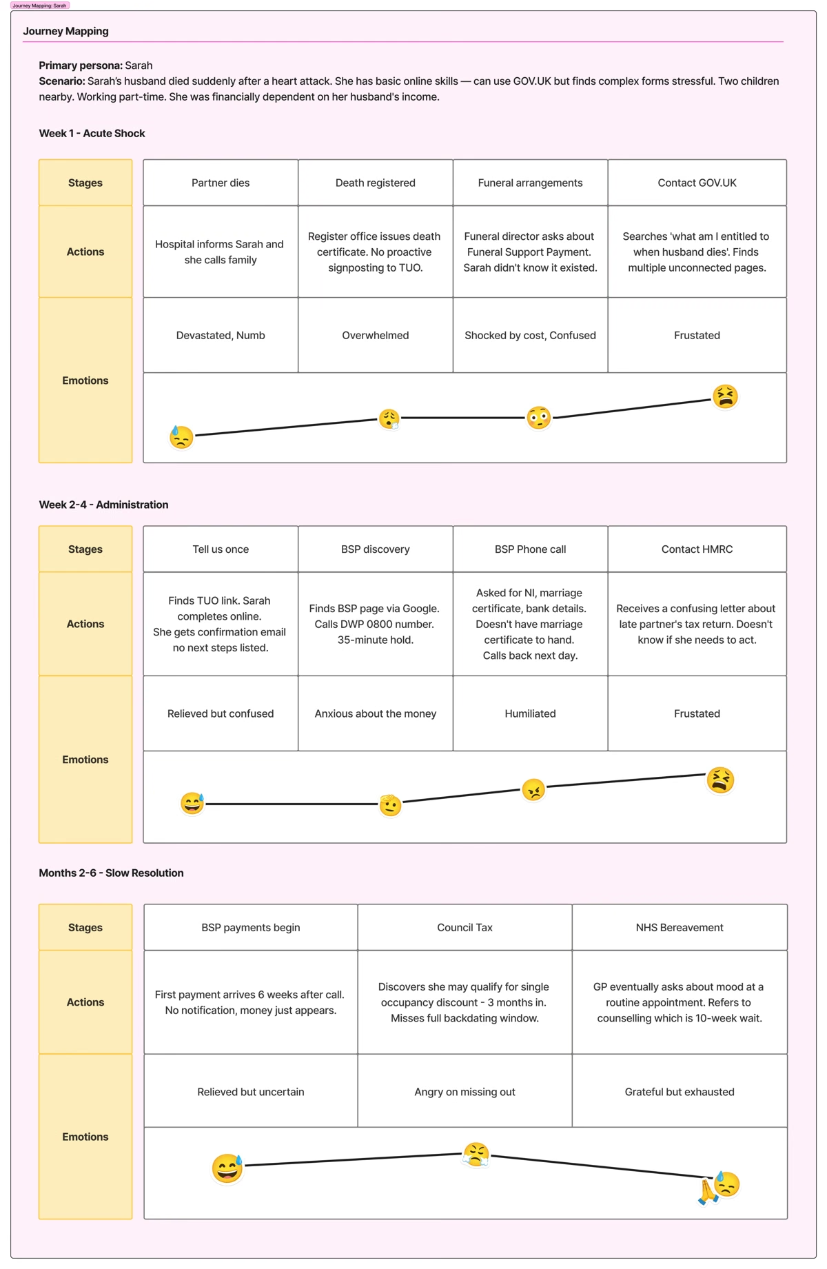
Sarah and James are composites built from stories in the research. Their quotes are written to represent those stories, not taken word for word.
05 · The map
Before this step, I would have proposed a redesigned GOV.UK page. It’s the obvious fix: put everything in one place. Then I mapped every touchpoint a bereaved person could pass through before reaching BSP.
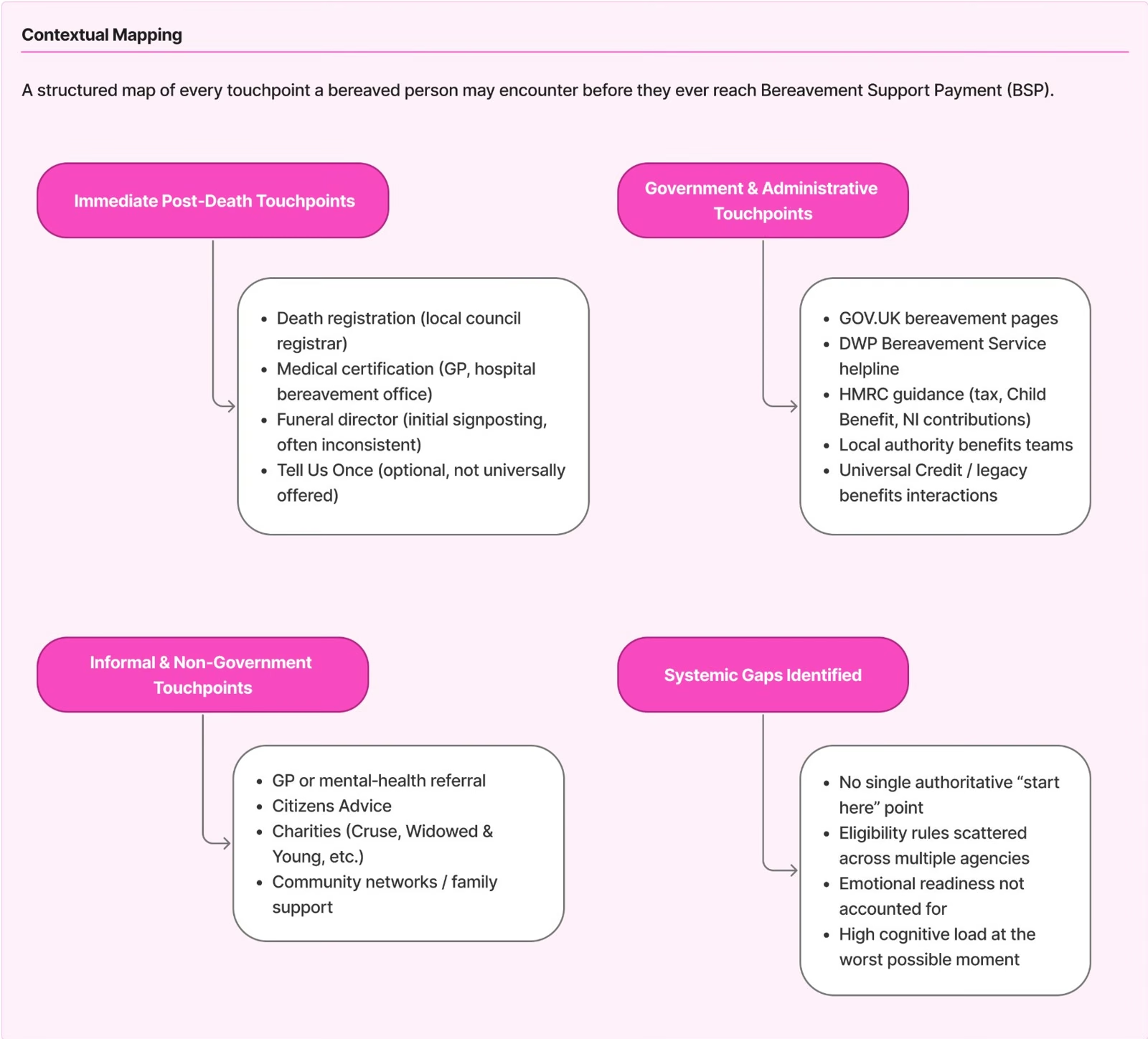
No single “start here” point anywhere in the system, and no official touchpoint that mentions the 3-month window. The rules were spread across at least four agencies.
A better page only helps people who already know to look for it. The service had to find people, at more than one moment.
The three-layer structure came straight out of this map.
Putting the whole system on one surface showed a gap that no single screen could fix.
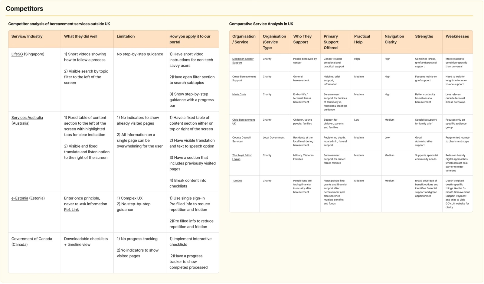
I reviewed bereavement services in four countries and services from other sectors that solve a similar problem. One pattern held across the strongest ones: the service makes first contact instead of waiting to be found.
Breaks a complicated process into clear stages.
Asks a few questions, then gives personal next steps.
You give your details once and never repeat them.
How might we
make sure bereaved people get the right information, without having to search for it, in a way they can take in while grieving?
06 · The choice
Bereaved people aren’t one group. An older widow, a teenager like James and a working parent like Sarah meet the system at different moments. We compared four directions.
What it cost
More moving parts, and none of the three layers has been tested with users yet.
07 · The service
The same principle runs through all three layers: the service makes contact first. No dead ends. No navigating without direction. No deadline without a clear way to act on it.
Not to scale. The dashed line marks the 3-month deadline for the full payment.
When I designed the screens, the checker and the professional tool turned out to need the same questions. So they became one GOV.UK service with three ways in. Professionals get the questions with the exact words to say, and a summary they can hand over.
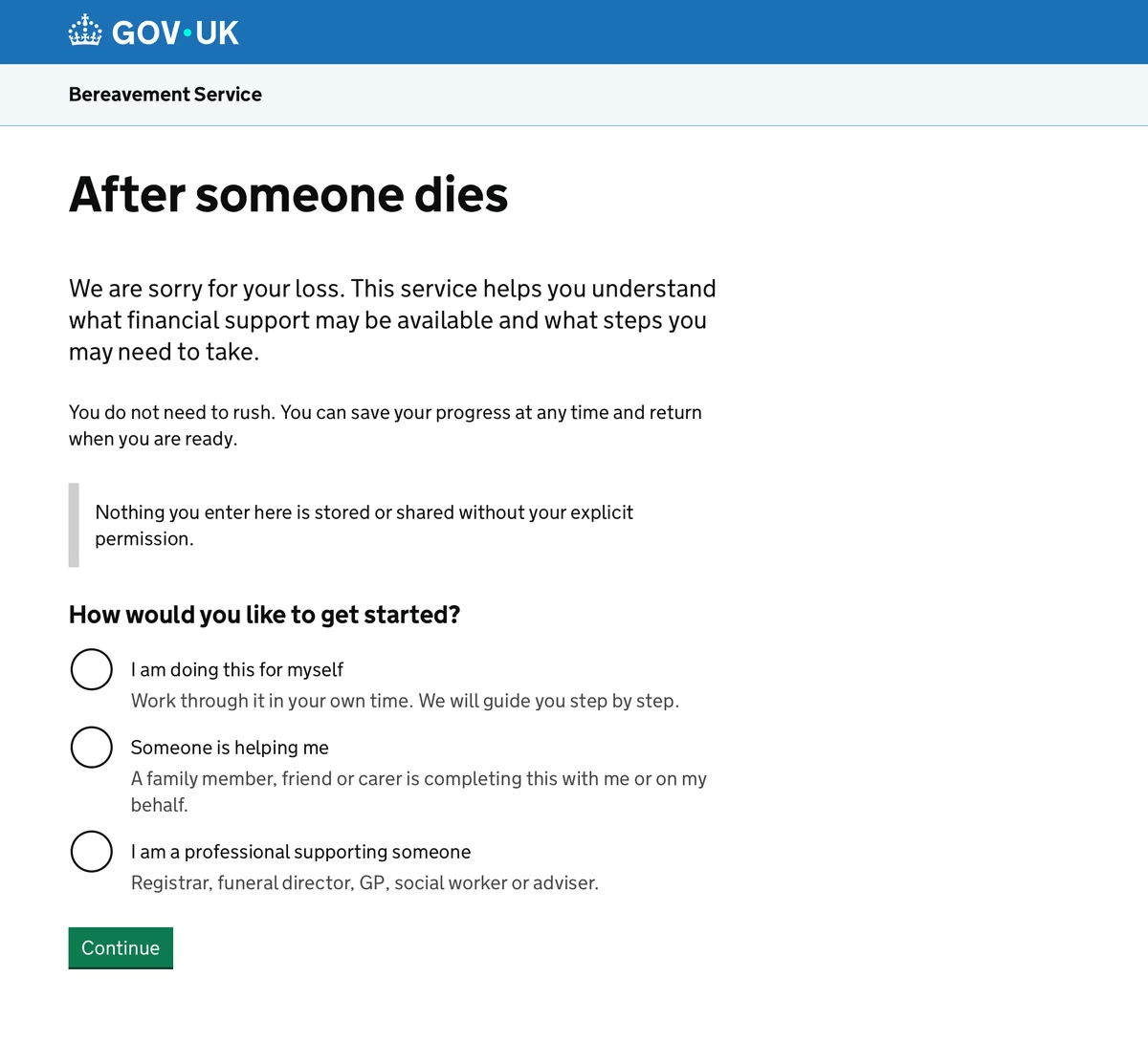
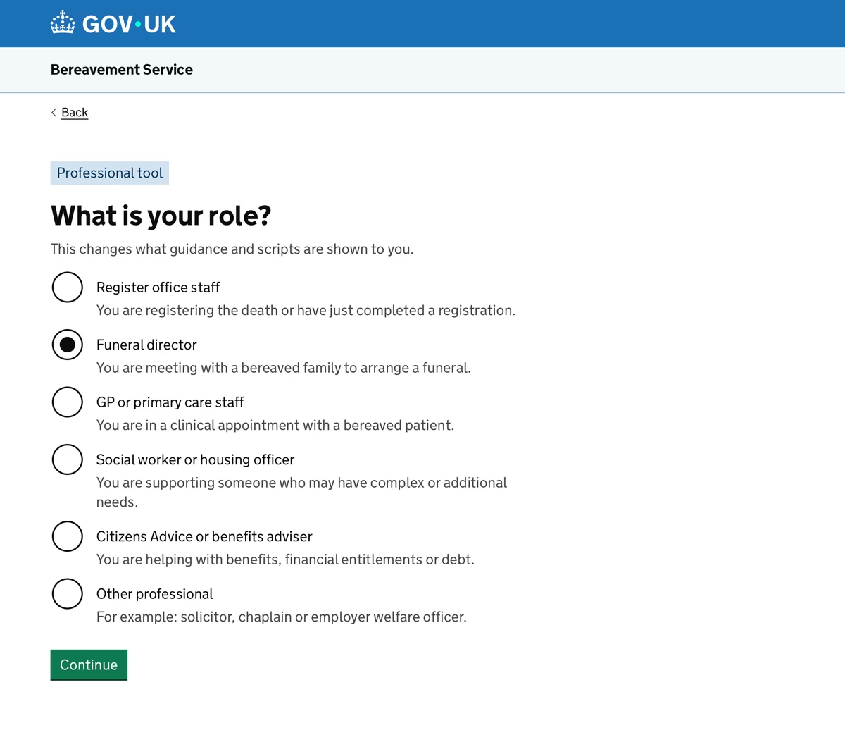
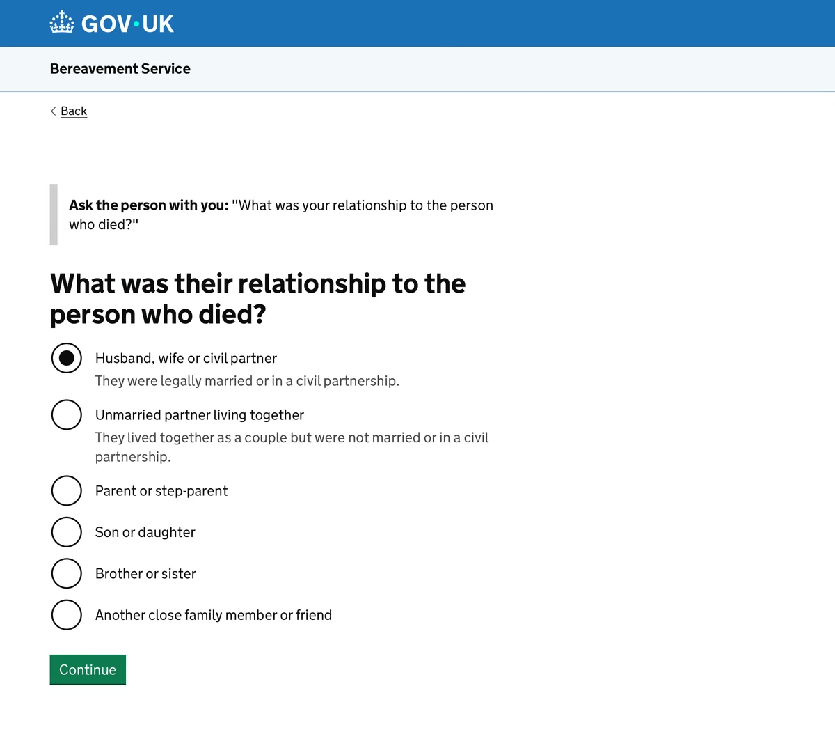
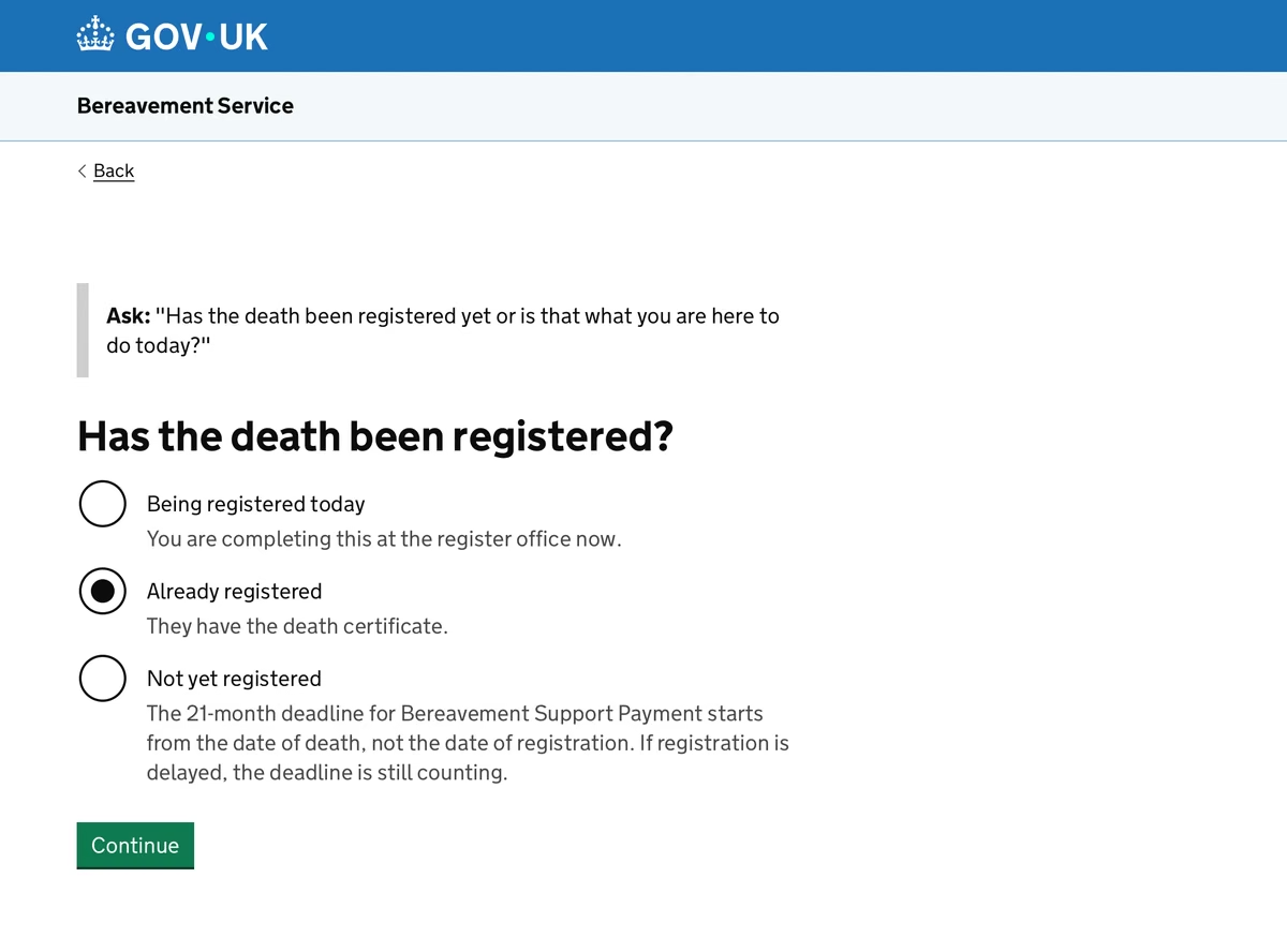
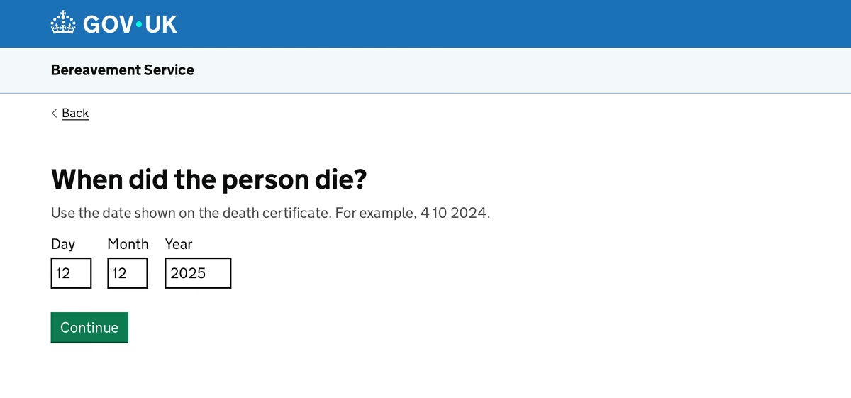
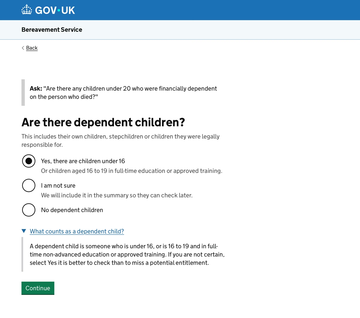
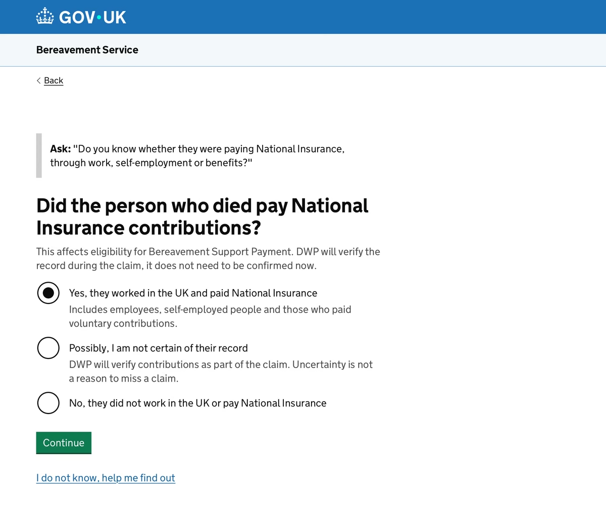
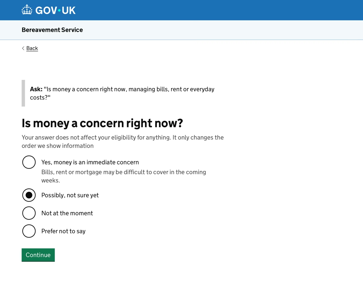
Deadlines first, then each payment with likely eligibility and the number to call.
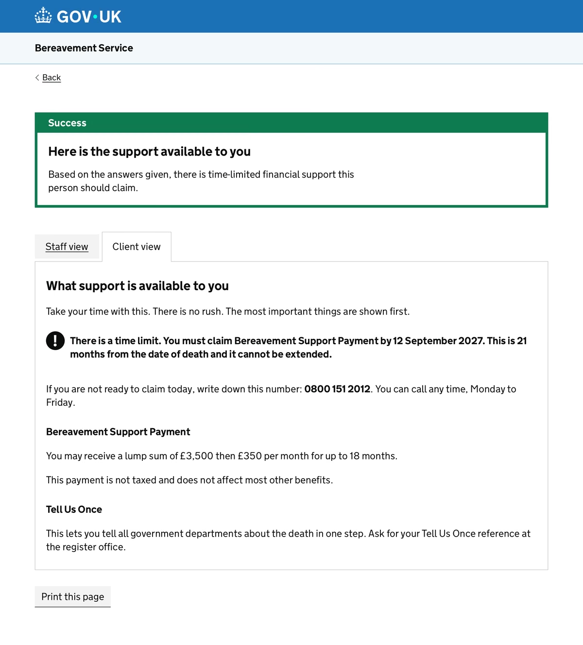
Plain words, one time limit in bold, and “Print this page”.
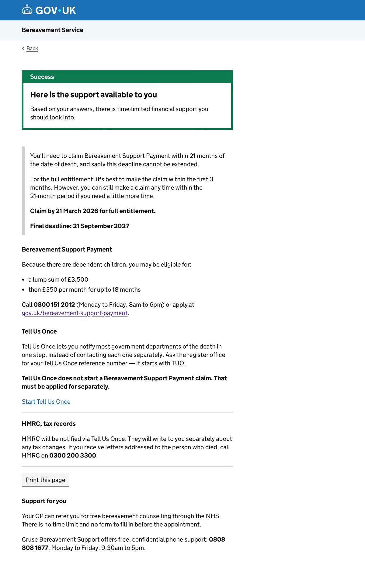
The same content, written to “you”, with support for grief at the end.
Before they leave, the professional says
“The most important thing to do is apply for Bereavement Support Payment. You have 21 months from the date of death to do it. If you are not ready today, write down this number: 0800 151 2012.”
From the staff view. One sentence, so the most important thing gets said even if nothing else does.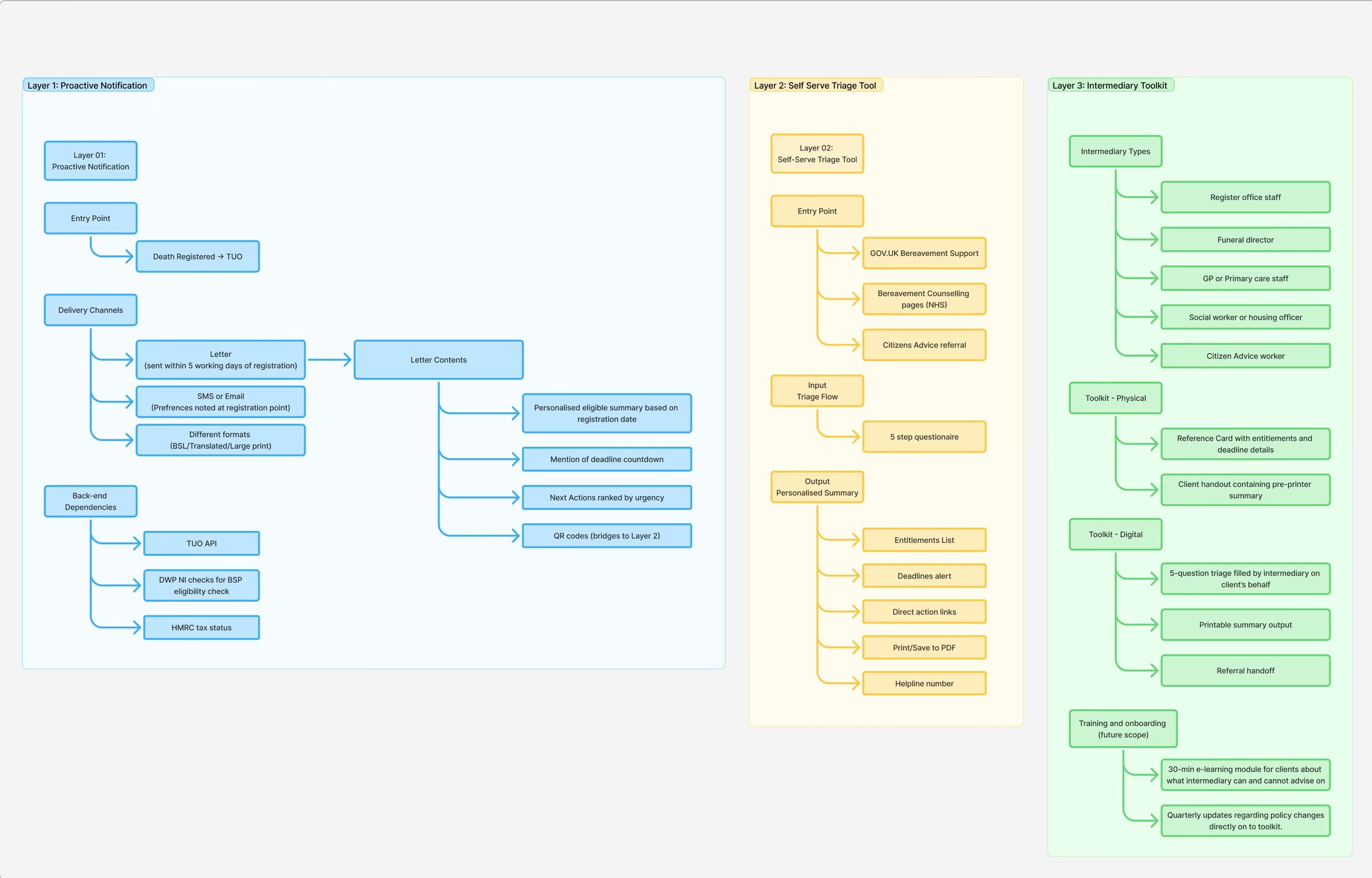
08 · Reflection
I chose public posts over rushed interviews with people in grief. It gave us more material than five weeks of recruiting could, and it’s the decision I’m most proud of. The cost is that the sample isn’t representative, and I say so wherever the findings appear.
Before the mapping, I’d have redesigned a single GOV.UK page. The map showed that a page only helps people who already know to look.
The smallest theme shaped the whole service. That took judgement beyond a count. It’s my reading, not a measured result, so I’ve shown the numbers behind it and let the reader judge.
No live testing yet, and the two questions below are where I’d start.
Risk: older bereaved spouses are the most likely to receive it, and the least likely to recognise an unfamiliar DWP letter as important.
Next step: test with people aged 60+, people with low digital confidence, and people who didn’t manage the household accounts.
Risk: partners who lived together but weren’t married, deaths abroad and complicated older benefits weren’t fully mapped.
Next step: a sprint testing the checker against unusual relationship statuses and mixed benefit histories.
13,000+ coded sentences from public posts, eight themes and 41 codes. Reddit users aren’t a representative sample.
Strong services in other countries and sectors make first contact. That’s precedent, not proof it works here.
As far as I checked. Whether it can trigger the letter is untested.
Usability testing with bereaved people. Not done, and needed before any launch.
The full story has more detail than fits here, including the options I rejected and what I’d test first. Get in touch for a walkthrough.
Open to UX, product and UI design roles, across consumer, hospitality, public sector and complex multi-user products.
Text
Display